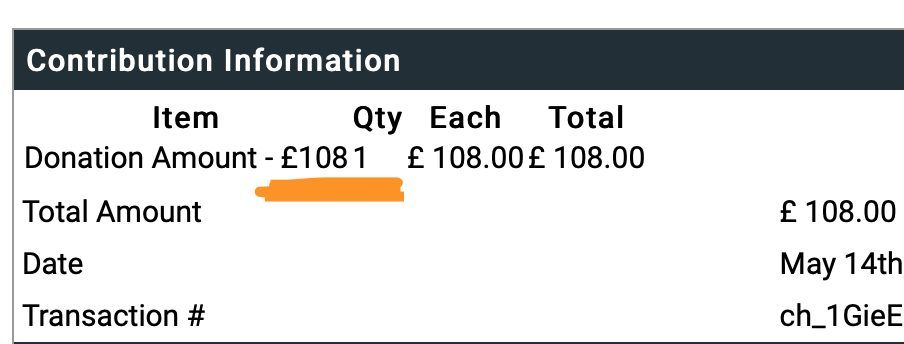
As it can be seen from screenshot below, the "QTY" column is too close to the "Donation amount" and often times it can be mistaken as "1081" instead of "108". Is there a way to adjust the column width of QTY on a contribution receipt? I have tried add style="min-width:20%" but doesnt work. Any tips would be much appreciated. Thanks
Add a comment
|
1 Answer
would be nice to have border for tables to avoid confusion. you can add css in your message template, either it can be inline or using tag
{literal}
  <style>
    .button-group {
      display: block;
      margin-top: 5px !important;
      margin-bottom: 5px !important;
   }
  </style>
{/literal}
Thanks Pradeep
-
Thanks, but it didnt help? is button-group an existing class within message template?– TapashCommented May 14, 2020 at 13:58
-
1i just provided an example how you can add style in message template Commented May 14, 2020 at 13:59